
Complete Case Study
A more detailed version of this case study can be accessed at https://bit.ly/3bKPN4P
Helping users who have limited time to complete their weekly shopping

Introduction
Walmart has been the most dominant retail corporation in America attracting 140 million shoppers annually spread over 8000 locations across the United States.
90% of Americans live within 10 miles of a Walmart so most shoppers prefer completing their shopping in-store than ordering online.
However, not all Walmart shoppers have the same time to complete their shopping. Some can afford to spend more than an hour while others might only have a maximum of 30 minutes to finish their shopping.
Problem Statement
"If a Walmart shopper has a very limited time window to complete their weekly shopping because of a busy schedule, how can the mobile app help accelerate the process?"
Design Challenges
Objective 1
'Redesign the shopping list feature of the Walmart mobile app so users are able to make changes to their shopping lists faster'
Objective 2
'Integrate the redesigned shopping list into a solution that helps users navigate Walmart stores faster'
UX Process
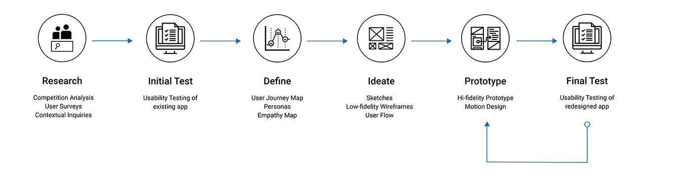
1. Research
Competition Analysis
We analyzed the primary functions of the shopping list features of some of Walmart's immediate competitors. We also found that the built-in maps were the only common tools that helped with in-store navigation for 2 out of 5 apps so we also analyzed the features of the in-store map.

User Surveys
We started our user research by conducting an online survey to understand how users felt about the shopping list feature in the Walmart app. We asked questions regarding their behavior when it comes to using a shopping list including how often do they change their list while shopping, how many items do they shop for and what are the current challenges of using the Walmart shopping list app.
Key Findings

Contextual Inquiry
We conducted an on-site contextual inquiry with two participants where we observed how they used the mobile app to navigate the store as well as the shopping list feature.
Key Findings

2. Initial Testing
Usability Testing of Existing App

We conducted 5 usability evaluation sessions with users to gauge the functionality and usability of the shopping list.
We were able to uncover several functional and UI limitations that frustrated users because it impeded on their ability to complete several of the assigned tasks without facing obstacles.
Task Assigned and Observed
1. Use regular search to find and add item to shopping list
2. Use voice search to find and add item to shopping list
3. Create a new list with items from other lists
4. Add a new item to an existing list
Key Findings

Final SUS Score

3. Define
Isolate Pain-Points with a User Journey Map
We created a user journey map that cover all user actions, pain-points, user feelings and proposed solutions while they navigate the store on a limited time window.

Understanding our Users with an Empathy Map
We used the qualitative feedback from the usability testing sessions and the contextual inquiries to create an empathy map that helped us understand what our users were thinking, feeling, saying and doing when interacting with the Walmart app.

Meet Zhang Wei - Our Primary Persona
Our solution was optimized for the shopper who has an extremely busy schedule and there's no one more busy than a college student who has limited time to shop because of demanding school work.

4. Ideate
Sketching an AR solution for in-store navigation
The map was universally seen as an unnecessary part of the app. Hence, we decided to remove it completely from our design and started ideating an AR solution for in-store navigation.


Converting our Low-Fidelity Wireframes into a User Flow
We created a series of low-fidelity wireframes for the shopping list and we organized them into a user flow.

5. Prototype
Multiple touchpoints to add items to a new list
By increasing the availability of the 'Add to List' button through multiple touchpoints, we reduce the number of steps for the user which in turn allows them to create lists faster.


Search and add items faster from within a list
We reduced the number of steps it takes to add an item to a shopping list from within the shopping list itself. Users can now directly search for and add the item from the overlay.


Move items between lists
Our design allows users to permanently move items between lists or replicate them to be added to other lists. This is massive improvement from the previous design which forced users to manually search and add items to new lists.


Merge Lists
A user can now merge items from two lists instead manually searching and adding items from one list to another.


Additional touchpoint and functionality for voice control
A user can now access voice search from within a shopping list to add an item using voice only. This feature was missing in the existing design and voice search only had one touchpoint which was on the homepage


Making navigation faster with AR
Our AR solution uses the signboards across the store as a location point for the user and then generates a path from that location point which covers all unchecked items on the shopping list. If a user edits the list, a new path is generated as per the new list.


Finding items within an aisle is much faster
Our AR solution locates items within the aisle (As per the shopping list) and shows users where the item is placed. In addition, a user can scan the barcode on an item and it get checked off the list.


Easily find seasonal items and discounts
A user can edit their shopping list to include seasonal items or discounts or promotions that are in their proximity.


6. Final Test
Usability Testing of our Redesign
We conducted 5 testing sessions with the same participants that we tested the original shopping list with. We showed them the redesign and gave them the exact same tasks
Task Assigned and Observed
1. Use regular search to find and add item to shopping list
2. Use voice search to find and add item to shopping list
3. Create a new list with items from other lists
4. Add a new item to an existing list
Key Findings

Final SUS Score

Key Takeaways
Grocery shopping can be a stressful experience for users who do not have much time on their hands.
Time is the one factor that puts users in difficult situations where they need to make quick decisions.
If these features are implemented, we know that the current user experience of Walmart’s customers would be elevated to the point where they would be looking forward to their weekly shopping journeys despite a tight schedule.
Complete Case Study
A more detailed version of this case study can be accessed at https://bit.ly/3bKPN4P